Miter International Case Study
UI/UX designers, frontend and backend developers, DevOps engineers, QA, SEO specialists, and a project manager
9 months
- Automated sales process
- More website traffic
- More inquiries
miter
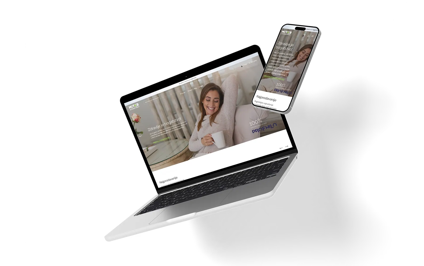
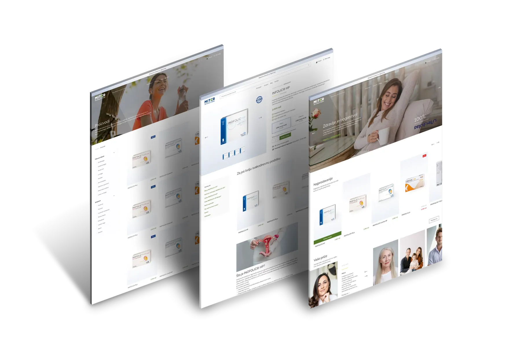
The exclusive importer and distributor of innovative pharmaceutical products, Miter International, launched a new website designed to automate sales processes and expand its online premium product offering.
3 Key Results We Achieved
Process Automation
Sales process automation reduced manual work and improved efficiency across order management and product updates.
Scalability
Miter International can now grow product offerings without adding complexity or losing functionality
Market Positioning
The new website strengthens client’s reputation as a reliable distributor and supports long-term relationships with healthcare professionals, partners, and customers.
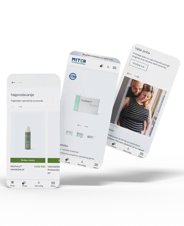
With a modern interface and advanced E-commerce functionalities, Miter International now manages processes faster while expanding its offer and building trust among users.
Challenge
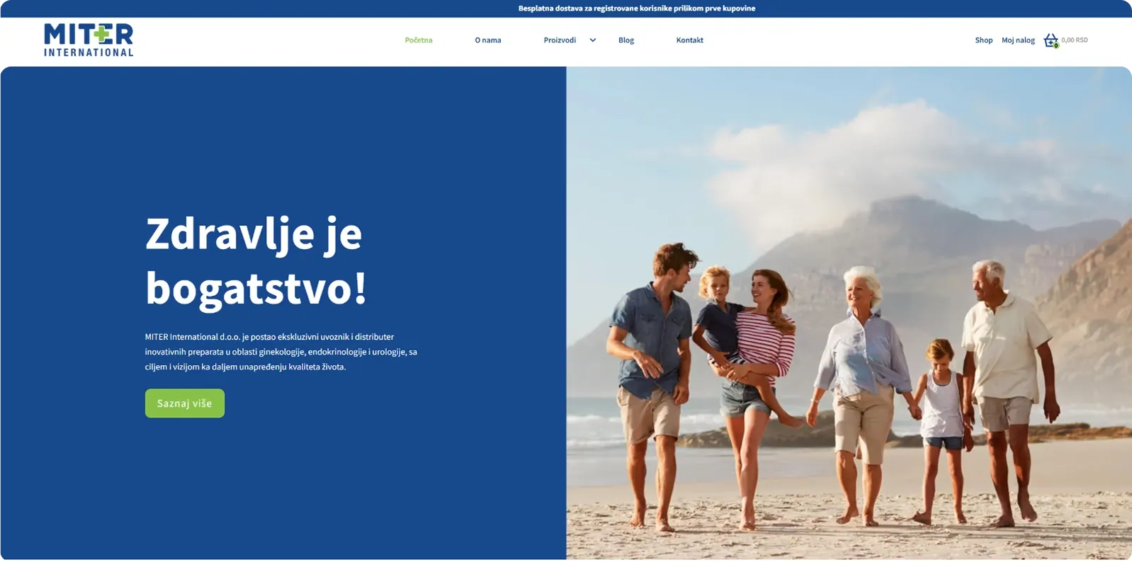
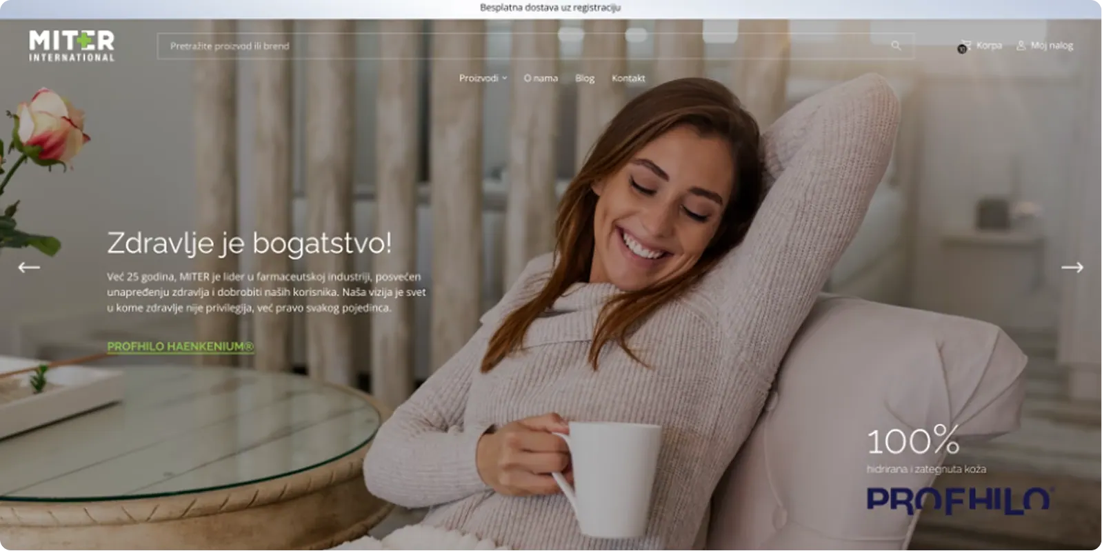
There was no search option in the main menu, making it difficult for users to find products on the site, especially if they know what they’re looking for.
The hero banner didn’t communicate the brand’s values and lacked a strong visual impact.
Solution
A clearly visible search bar now enables quick and effortless navigation across the site.
A modern video hero banner captures attention, while strategically placed information and a CTA button guide users exactly where you want them. Closer to making a purchase.
Challenge
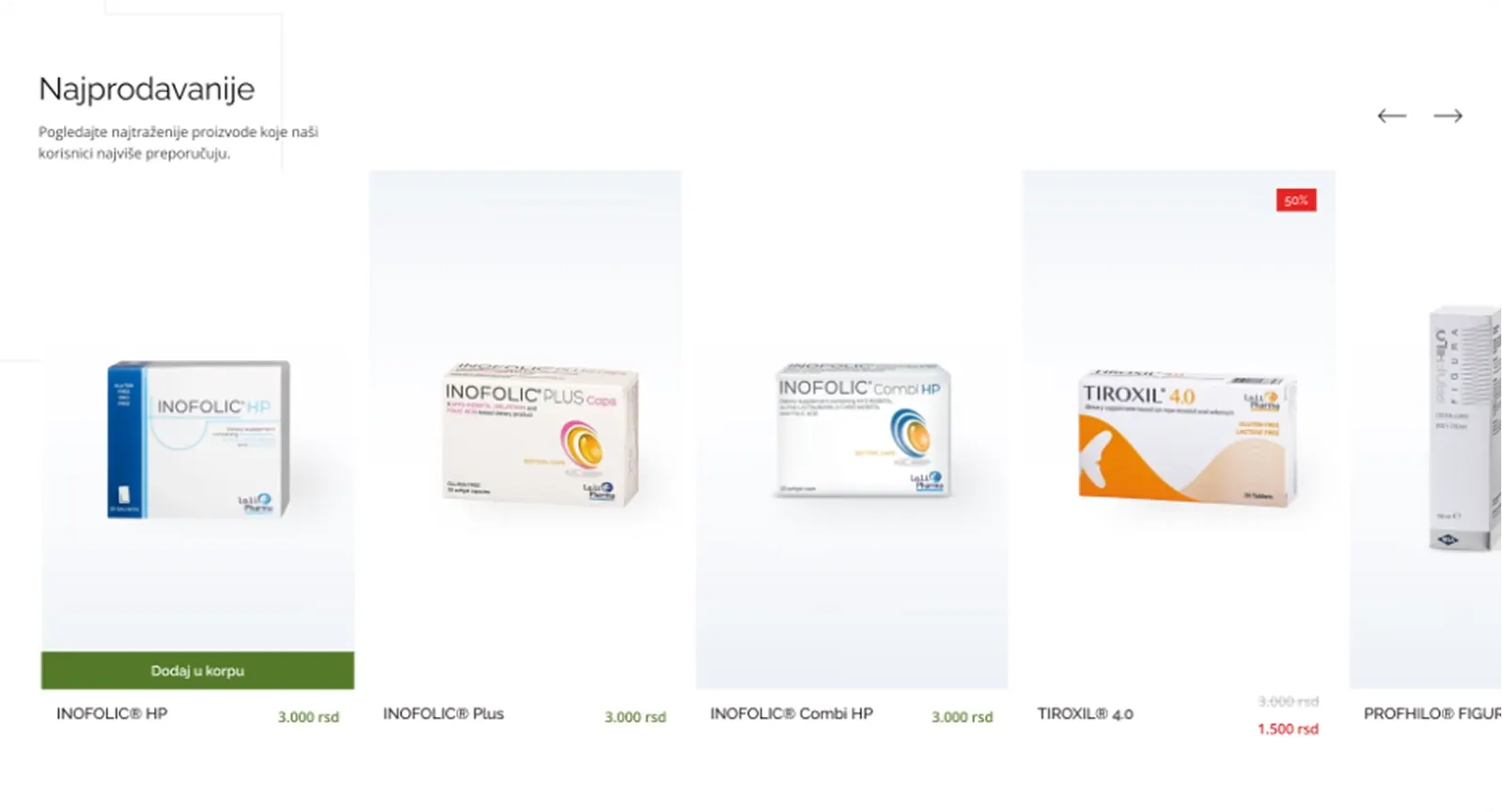
Products were displayed in a slider, slowing down the user’s path to the desired item. They were also not visually prominent enough to spark curiosity or engagement.
Solution
Products are now clearly and attractively presented within a single section. Subtle animations draw users’ attention, placing the product at the center of focus and increasing the likelihood of conversion.
Challenge
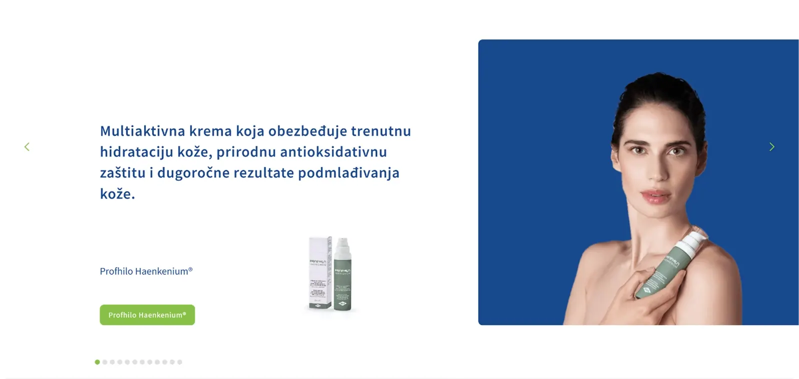
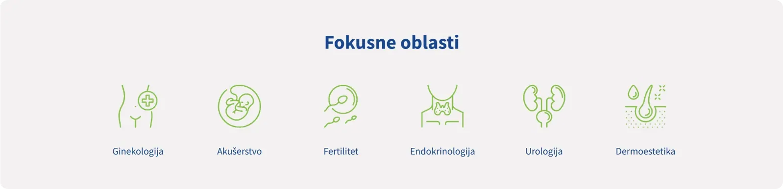
A two-dimensional presentation of focus areas does not clearly communicate them to the user. To find relevant information, users have to navigate further into product pages.
Solution
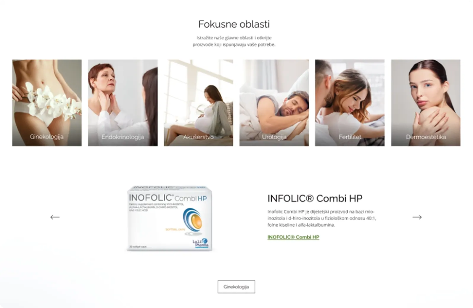
Images with clearly highlighted focus areas that transform into video on hover add visual dynamics and immediately signal the purpose of each section. Below each focus area, products are presented in a modern layout. A CTA button on each product leads directly to the product category, making navigation easier and encouraging purchase decisions.
The initial response from users is great, and their experience on the website is much better than before. In the background a massive task they accomplished was all the integrations. Our teams do not have to do any of the administrative/financial tasks that we previously had to do; it is ALL automated.
Sonja Somborac Director of Marketing
Automated E-commerce flows, secure checkout, and faster product discovery ensure healthcare professionals and customers can order with confidence and convenience.